|
|
Post by Swarm on Jul 23, 2022 8:28:47 GMT -5
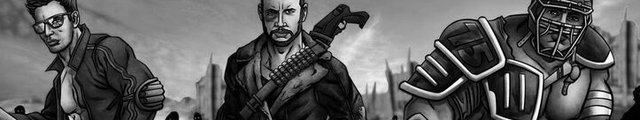
I loved the first Ursa Major that they showed, and was sort of disappointed in the new one because he looked too cool? I wanted a dope like the Carter drawing. Now I am a bit worried that black hole Bart and Astro Turk will end up looking like their egos as opposed to what they should look like. Nobody needs good looking or in shape Astro Turk and black hole Bart. I thought the first color Ursa Major looked like Uranus. Puny. The original Ursa Major by Chuck wasn’t puny or dopey, he was just a poor wrestler. His image didn’t change as he progressed in the ring. He always looked similar to his original self with a shorter haircut. At no point in his career did he pack on weight and change his physique. The second version of colored Ursa looks more like Chuck’s original rendition to me. Meteor Storm are definitely dopes and will retain that image in color 2093. |
|
|
|
Post by zombietots on Jul 23, 2022 10:41:18 GMT -5
Awesome news. looking forward to it. On a sad note. My early classics by Werner Mueck along with a few other sets I had (Yet replaceable) are gone. (One appears to be ruined by soda) Will there be and Early classics remake to buy in the future. I miss my old 70s federation; Paladin Power was my favorite duo. Solar Flare & Moonstrike. That art was awesome. Oh man, Jammer and Blood. I loved all those tag teams back then.
|
|
|
|
Post by Shane Sullivan on Jul 23, 2022 13:13:32 GMT -5
Being Ursa was a cruiserweight, I liked the spindly look. Each to their own. But hearing that Black Hole Bart and Astro Turk will look like they should brings a smile to my face. If the Carter art for those two ever can up for auction I would open a home equity line... Would have to, to take down deep pockets Baccaccio.
|
|
|
|
Post by Swarm on Jul 23, 2022 14:42:57 GMT -5
Being Ursa was a cruiserweight, I liked the spindly look. Each to their own. But hearing that Black Hole Bart and Astro Turk will look like they should brings a smile to my face. If the Carter art for those two ever can up for auction I would open a home equity line... Would have to, to take down deep pockets Baccaccio. Knowing Grant, he would win it, then gift it to you. Very generous. Far as Ursa goes, the reason given for the puny design was because he had such poor power. Mike & I competed in an Academic Decathlon similar to how they settled things in Billy Madison, and I won in the end. Mike dominated 20th Century Poetry and Reflections of Society in Literature categories, but I beat him in Business Ethics, Stat Design and Arm Wrestling. |
|
|
|
Post by wayne on Jul 23, 2022 14:44:06 GMT -5
Great news 2093 is going to be in the works. I thought I heard once war games would be end of the line for reimagined. I hope not and that it continues. Right the way up to when the first colour edition started (was that 2125). Lol, that would take about 15 years to get there though.
|
|
|
|
Post by Swarm on Jul 23, 2022 14:46:24 GMT -5
Great news 2093 is going to be in the works. I thought I heard once war games would be end of the line for reimagined. That’s true far as current plans. Todd mentioned that at GCON. |
|
|
|
Post by Shane Sullivan on Jul 23, 2022 16:48:02 GMT -5
[/quote]
Knowing Grant, he would win it, then gift it to you. Very generous.
[/quote]
I don't know, Grant has a soft spot for the boys. I could see him taking me to a half mil just make me mental. The best heel turns are the ones you don't see.
|
|
|
|
Post by on_the_edge on Jul 23, 2022 17:36:16 GMT -5
I loved the first Ursa Major that they showed, and was sort of disappointed in the new one because he looked too cool? I wanted a dope like the Carter drawing. Now I am a bit worried that black hole Bart and Astro Turk will end up looking like their egos as opposed to what they should look like. Nobody needs good looking or in shape Astro Turk and black hole Bart. I thought the first color Ursa Major looked like Uranus. Puny. The original Ursa Major by Chuck wasn’t puny or dopey, he was just a poor wrestler. His image didn’t change as he progressed in the ring. He always looked similar to his original self with a shorter haircut. At no point in his career did he pack on weight and change his physique. The second version of colored Ursa looks more like Chuck’s original rendition to me. Meteor Storm are definitely dopes and will retain that image in color 2093. I agree, Meteor Storm are dope. But their pictures did not reflect that. They looked like you guys used their DMV pictures. |
|
|
|
Post by Mynnotaur on Jul 23, 2022 20:41:16 GMT -5
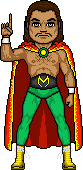
I do not like the “new” version of Thantos. It might be because the original Thantos art is one of my all-time favorites in regards to art.
|
|
Pegasus
Infinity Challenge

Posts: 147 
|
Post by Pegasus on Jul 24, 2022 0:34:53 GMT -5
I agree with the others regarding the change in Thantos' appearance in the reimagined set. Appearance wise, it does tie in better with his GWF classics cards, but his original 2087 card by Carter was iconic, to me. I wouldn't mind seeing Mr. Banks take another crack at that, but make Thantos look more like he did in the Carter art, big, imposing, threatening looking.
I also wish that Massacre had kept the 'stache... maybe it could have been made slightly wider so as to not look so much like a Hitler moustache, but it does make Massacre look just a bit less intimidating looking without the classic moustache. And why does Star Warrior have patchy chin stubble? What's the deal with that?
Having said all that, both sets are awesome. The original 2087, I've always thought was Carters best work, and Banks did an outstanding job reimagining these wrestlers, minor appearance quibbles aside.
|
|