|
|
Post by LWPD on Sept 17, 2011 17:10:02 GMT -5
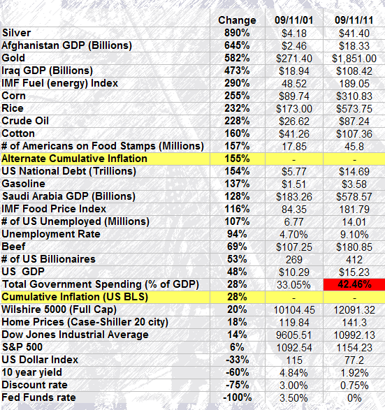
Below is an interesting chart that examines the performance of various asset classes and economic statistics since 9/11. From the price of gas to the rate of unemployment, a lot has changed over the last ten years. Among commodities, silver was far and away the biggest winner. Food and energy inflation hit triple digit gains, while the purchasing power of the U.S. Dollar went the other direction. The Wars on Terror surged the amount of American debt by trillions, yet coincided with massive gains in GDP for target countries Afghanistan and Iraq by billions! Courtesy of Barry Ritholtz (Fusion IQ)
Performance Chart: 9/11/01-9/11/11 |
|
|
|
Post by marktaggart on Sept 18, 2011 9:24:07 GMT -5
We can talk about the real reasons and outcome of what's been going on this past decade, or we can do what has been done here and just show the numbers. The numbers, as they say, speak for themselves.
|
|